Case Study
Law of Proximity
Consolidating Marketing Promotions
Introduction
As part of the efforts to optimize the Product Display Page (PDP) we set up a series of AB Tests to start moving toward the Future State Design plans. This effort also help align another initiative for an overarching Offer Management customer journey.
Project
AB Test: Promotional Consolidation
Industry
Retail, Ecommerce, Video Commerce
My Role
UX/UI, Prototyping
Team
AB Testing Specialist
Problem
The Product Page’s lack guidelines over the years has led to scattered placement of marketing offers and promotions in all shapes and sizes. Left open to interpretation, business partners added marketing messages in various shapes and sizes all over the page, driven by the priority of their individual business goals without consideration of the rest of the experience or the mindset of the customer. Customer research found that customers were not seeing crucial information, even if it was bold, red, and displayed at the top of the page.
Proposed Solution
We would combine all duplicate Promotional offers on the page and reduce the offers to be specific to the product only.
We also would consolidate all of these offers into a single location. Consideration to use of icons to help draw attention and provide some clarity to the types of promotions the company typically offered our customer on a product/category level.
We would launch a series of AB Tests to eliminate guessing as to which changes enable which results.
AB Test #1
Hide Duplicative VIP
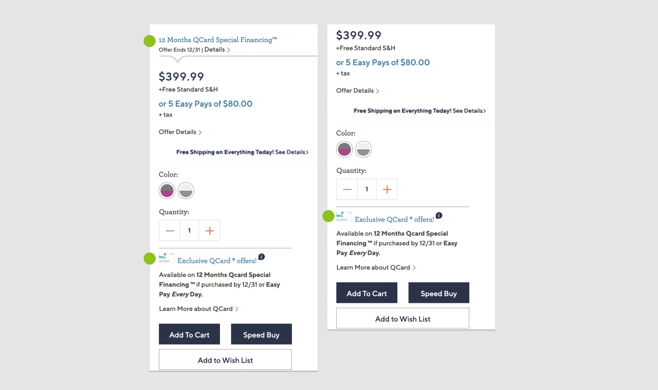
For the products that qualify for special financing, we displayed promotional messaging twice on the PDP. Once in the promotions & offers section and next to the price block. To make matters worse the location was inconsistent on desktop, which was at the top of the page. We determined that the first test would be to learn if we can clean up the page by removing the duplicative messaging without having any negative impacts to revenue KPIs or credit card usage.
Control Version
Show both the higher and lower locations of the VIP financing.
Test Version
Hide the higher location, only showing the VIP financing in the promotion section

Measures of Success
- Bounce & departure rates
- % to cart
- Credit card usage
- Revenue KPIs: Conversion, revenue & average items
Testing Results
Behaviors
- Customers are bouncing at a slightly lower rate
- Removal of the link increased scroll rate on the page, potentially due to removing distraction of the VIP messaging
- Customers are adding to bag at a slightly increased rate. This does not impact conversion but does increase average items for non-members.
- We see an increase of customers purchasing with special financing (though not statistically significant)
KPIs
- Cleaning up the experience drove an increase to top line spend, resulting in incremental gains of $169,028
- Non-members benefitted the most from removing this messaging with an Increase in 12.65% Spend and Increase of 12.61% Avg Items
AB Test #2
Consolidation of Promotions
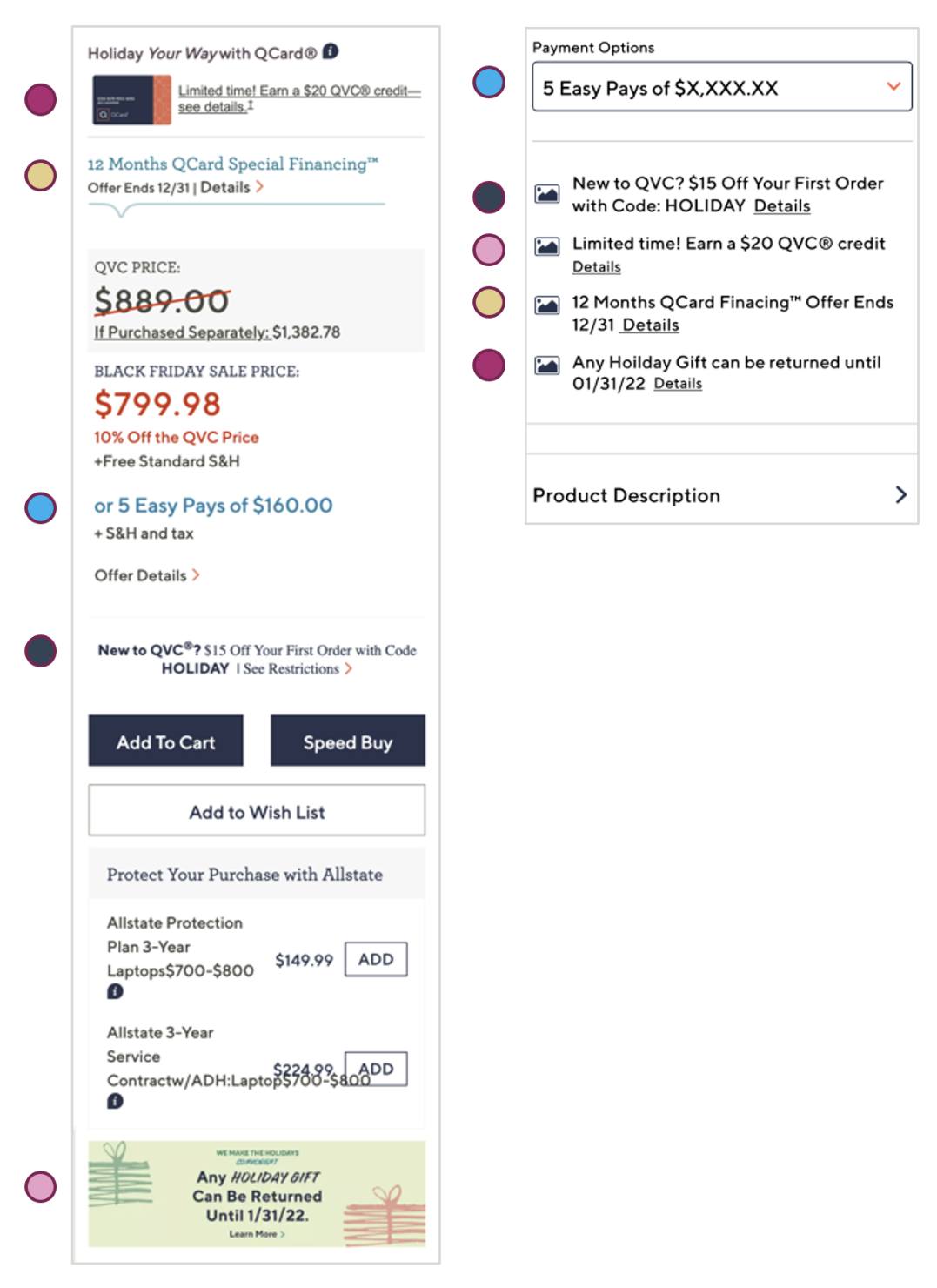
Our goal with this test is introducing a centralized hub of all our promotions on the PDP to provide customers with a consistent and straightforward shopping experience when it comes to the offers available to them. We believe that customers will continue to see and utilize the vouchers, credit card offers and other promotional handles if we move them below the Call to Action (CTA) button on PDP. This will also elevate the Add to Cart buttons higher on the page, improving conversion.
Control Version
New Customer Voucher, Credit Card Special Financing Offers and QVC Credit Card (QCard) promos in higher location with original styling
Test Version
New Customer Voucher, Credit Card Special Financing Offers & QVC Credit Card (QCard) promos consolidated and moved below the Call to Action buttons with consistent styling and icons.

Measures of Success
- Bounce & departure rates
- Engagement
- Voucher usage
- QCard take rate & sign ups
- Special Financing usage
- % To cart
- Scroll rate
- Increase in Spend
- Increase in Conversion
- Increase in Average items added to cart
Testing Results
Behaviors
- 1,071 more customers clicking interacting with vouchers
- Exposure to the Add to Cart buttons increased significantly in desktop and mobile, reducing the time before first click (most significantly in mobile)
- Add to Cart interaction increased by 1.4% likely driven by increased exposure due to elevating the add to cart button
- Fewer customers engaged with the QSF “See Details” however of those who clicked the “see details” link all 3 vouchers saw an increase in orders placed
- Customers are engaging with the links at a lower rate but making more purchases with their QVC Credit Card in the test.
KPIs
- Increase to top line conversion, spend, and average items, resulting in an increase of $1,118,575 in incremental revenue
- Special Financing usage to place an order increase of 158 orders placed in the test
- Increase in overall voucher usage to 758 orders indicating higher exposure
- Increases to overall offer usage and cleaning up the page made it easier for customers to move down the funnel
- Prospects increased all revenue KPIs Customers entering the site via several marketing channels converted at a higher rate
Next Steps
Since both tests proved to be successful the new Promotional Hub was implemented at 100%.
